CPU Profiling
PM2 Plus comes with a ready to use CPU profiling tool. All your servers can be profiled directly from your web dashboard. The visualisation tools then help you to visualize and interpret the results in order to improve your app’s performance. The profiling files can also be downloaded to be inspected later in the chrome development tool.
Why CPU Profiling?
The CPU profiling helps you diagnose the way your server’s CPU is used. The CPU is a central part in every computer, responsible for interpreting and executing almost every command and sometimes compared as the computer’s “brain”.
The more a web server needs to execute backend code, the more it needs a consequent CPU power. In a static content web server, there is not much to compute: only few things are done in the backend. In the case of a web API, on the other way, there is only backend code: the CPU is thus a key factor to expect high performance.
In term of CPU, beside getting the highest CPU power as possible, the only way to improve your API performance is by optimizing your code. The CPU profiling indeed offers the ability to investigate how CPU is used across functions in your code. Once the bottlenecks are identified, you are ready to take action.
Data Collection
How does CPU profiling work?
The first thing to understand is that a CPU can only handle one operation at a time and is either busy or idle. The CPU usage (%) is the amount of time the CPU is busy for a period of time. The goal of the profiler is to record all invoked functions when the cpu is busy and how long CPU spends time for each.
A first approach is the so called “instrumentation”. This method inserts a piece of code that counts number of calls and records execution time of functions. The downside of this method is its heaviness. It affects a lot the code execution and even if it is precise, it’s problematic in a live web server context.
An other approach is the “sampling”. In this method, the profiler interrupts the code execution at specific intervals and records the stack trace each time. Not every call are thus recorded, but after enough time, results are relevant. The greatest benefit is that it almost doesn’t affect the code execution and can be used in a production environment.
Some profilers uses an hybrid approach. They instrument code only to count number of calls (a cheap operation) and use sampling to measure function execution time.
The PM2 Plus profiler uses the sampling approach.
Data Representation
Once collected, such a large amount of data needs to be organized in a way that allows analysis and which puts forward problems. Here are three common ways to handle CPU profiling results.
CPU time is also represented as a percentage of the thread’s total time during that recording.
The Top Down View
The Top Down View displays a list of method calls where expanding a method node displays the method that have been called inside of it, this methods are the callees.
The following information are often given to describe CPU time spent on each method call (times are a percentage of the thread’s total time over the duration of the selected time frame):
- Self time: the amount of time the method call spent executing its own code and not that of its callees.
- Children time: the amount of time the method call spent executing its callees and not its own code.
- Total time: the sum of the method’s Self time and Children time. This represents the total amount of time the app spent executing a method call.
The Bottom Up View
The Bottom Up View displays a list of method calls where expanding a method’s node displays who has called it, its callers.
The Bottom Up View is useful for sorting methods by those that consume the most (or least) CPU time. Each node can be inspected to determine which callers spend the most CPU time invoking those methods. Compared to the top down tree, timing info for each method in a bottom tree is in reference to the method at the top of each tree (top node).
The Flame Graph
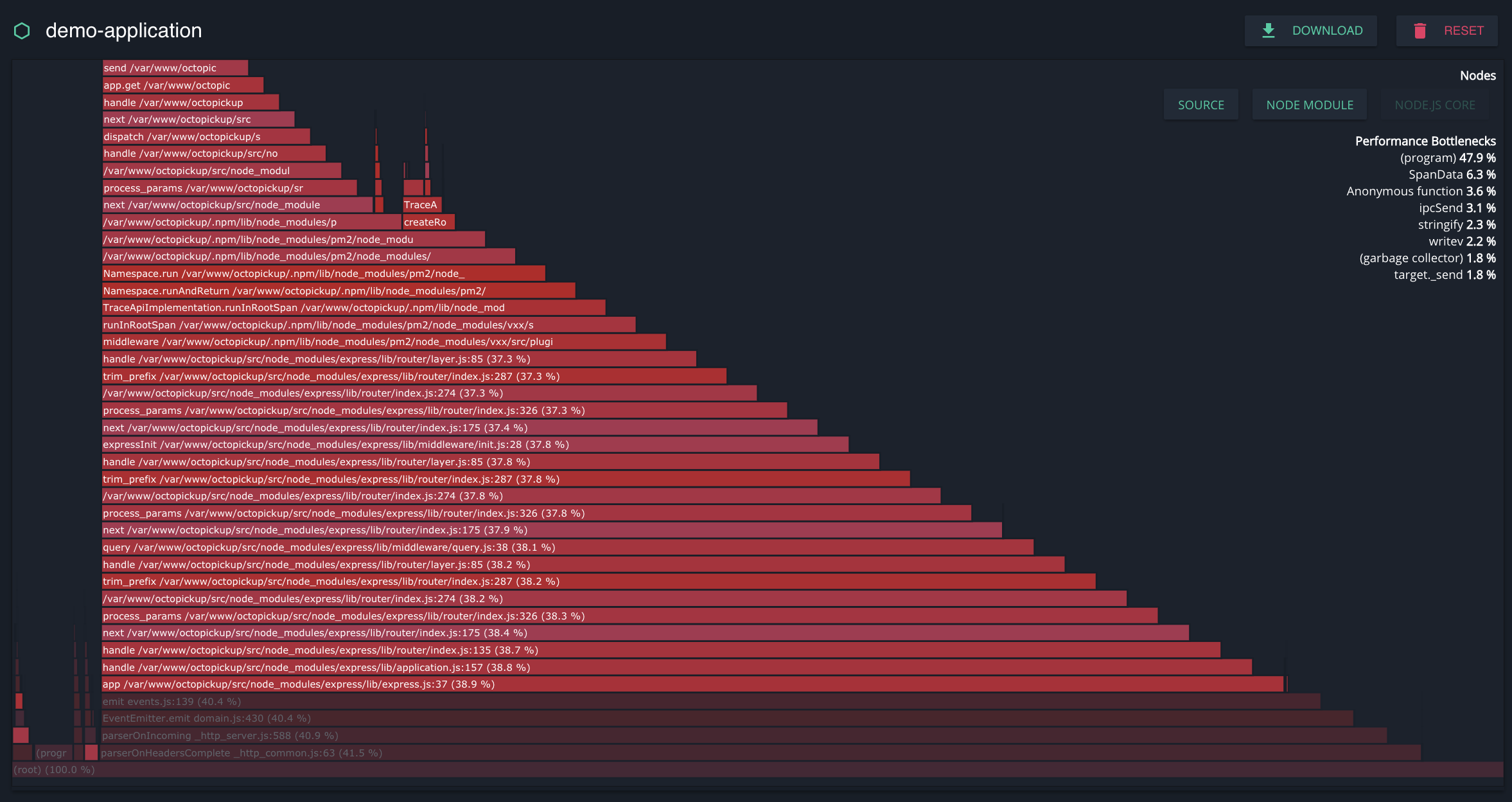
Each box in the flame graph represents a function in the stack.
- The y-axis shows stack depth. The top box shows the function that was on-CPU. Everything beneath that is ancestry. The function beneath a function is its parent, just like the stack traces shown earlier.
- The x-axis spans the sample population. It does not show the passing of time from left to right, as most graphs do. The left to right ordering has no meaning (it is alphabetical order).
- The width of the box shows the total time it was on-CPU or part of an ancestry that was on-CPU (based on sample count). Functions with wide boxes may consume more CPU per execution than those with narrow boxes, or, they may simply be called more often. The call count is not shown (or known via sampling).
- The sample count can exceed elapsed time if multiple threads were running and sampled concurrently.
- The colors aren’t significant, and are usually picked at random to be warm colors (other meaningful palettes are supported). This visualization was called a “flame graph” as it was first used to show what is hot on-CPU, and, it looked like flames. It is also interactive: mouse over the SVGs to reveal details, and click to zoom.